




Trade Show Marketing Strategies
10×20 Trade Show Booth Ideas (Plus 20×20 Island Layouts)
Stepping up from a 10×10 corner to a double-wide inline booth — or all the way to a full island — is one of the most exciting upgrades a brand can make at a trade show. But bigger space also means more decisions, and walking the show floor without a plan is how companies end up with an expensive footprint that still somehow feels underwhelming. If you’re searching for 10×20 trade show booth ideas that actually convert foot traffic into conversations, this guide breaks down the layouts, components, and design principles that make the difference.

Why a 10×20 Booth Changes Everything
A 10×20 space doubles your linear frontage compared to a 10×10, which means twice the visual real estate facing the aisle. That extra 10 feet lets you tell a richer brand story: one zone for product demonstration, another for collateral and conversation, and still room for a reception counter up front to slow down passersby.
The real opportunity is depth. Because a 10×20 booth is still only 10 feet deep, every square foot needs to earn its keep. Clutter kills the impact. The brands that win in this footprint treat the back wall as a billboard and the floor space as a curated experience — not a storage overflow area.
For teams new to this size, reading through a solid trade show displays buyer guide before specifying components will save real money and prevent costly re-orders.
Layout Options for a 10×20 Booth
The most effective 10×20 trade show booth ideas share one trait: intentional traffic flow. Here are the four layouts that show up most often on the floor, and when each one works best.
1. Anchor-Wall + Open Floor
Place your full 20-foot-wide graphic wall at the back, then keep the floor plan completely open. A single reception counter near one front corner gives staff a place to engage without blocking sightlines. This layout suits service-based brands where conversation is the whole product.
2. Two-Zone Split
Divide the booth roughly in half: one side for product display or demo, the other for a seating alcove or private consultation area. A tall display tower or banner cluster on the dividing line creates visual structure without requiring walls that close off the space.
3. L-Shape Perimeter
Run graphics across the full back wall and then wrap a secondary display down one side wall. This creates an L-shaped branded envelope that feels enclosed and immersive without requiring island pricing. Particularly effective if your neighboring booth is a competitor and you want to visually separate your space.
4. Counter-Forward Engagement
Pull one or two branded counters to the aisle edge, well-merchandised with product samples or tech demos. The back wall becomes a secondary visual backdrop rather than the primary engagement point. Works especially well for consumer product brands that need visitors to touch something before they’ll stop.
| Layout Style | Best For | Key Component |
|---|---|---|
| Anchor-Wall + Open Floor | Service brands, demos | Full 20′ backwall display |
| Two-Zone Split | Product + consult brands | Display tower, seating |
| L-Shape Perimeter | High-traffic shows | Side-wall graphic panel |
| Counter-Forward | Consumer products | Branded reception counters |
Key Display Components for a 10×20 Space
Backwall Displays
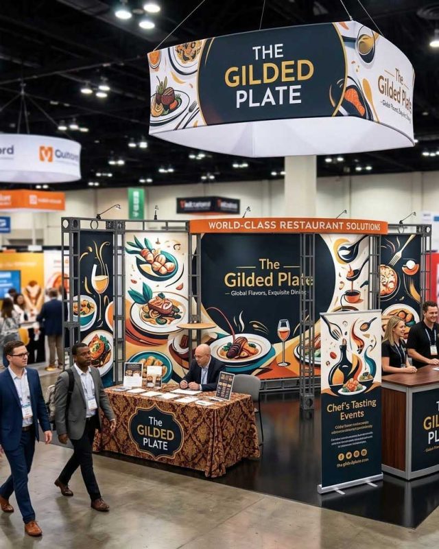
The 20-foot-wide backwall is your primary brand impression. The most popular options are tension fabric displays — large-format frames with dye-sublimated graphic panels that zip on, pack into a bag, and set up tool-free. They create a seamless, high-resolution mural effect that printed vinyl simply can’t match at this scale.
If you’re still weighing formats, the fabric pop up display guide walks through the differences between curved frames, straight frames, and modular configurations — useful reading before you commit to a 20-foot run.
Overhead Hanging Banners
One of the highest-impact additions to any 10×20 — and especially a 20×20 — is a hanging banner above the booth. When the show allows rigging, a suspended banner lets attendees find your brand from two or three aisles away. The trade show hanging banner guide covers approved shapes (circles, squares, custom silhouettes), ceiling weight limits, and when you need to notify show management in advance. Overhead signage is often the single best return on additional budget at this space size.
Counters and Kiosks
At minimum, every 10×20 booth should have one branded counter. Two counters — one at each front corner — let two staff members engage simultaneously without crowding the middle of the space. Look for counters with lockable storage compartments; at a two-day show, securing product samples and marketing materials overnight matters more than exhibitors expect.
Lighting
Inline booths at convention centers are routinely underlit. Clip-on LED rail lights or spotlight bars mounted to your backwall frame make a measurable difference in how vibrant your graphics read from the aisle. Budget 15-20% of your total display investment for lighting if your graphics have dark backgrounds or fine typography.
20×20 Island Booth Ideas and Design Principles
When you’re ready to scale up, 20×20 trade show booth ideas follow a different logic entirely. An island booth has four open sides, which means four separate entrances and four different visitor journeys to design simultaneously.
The priority in any 20×20 trade show booth design is accessibility: no visitor should feel like they’re intruding to enter. Remove rope lines and closed counters from the perimeter. Instead, draw people in with open corners, activity stations, or a central product display that creates natural curiosity from every angle.
20×20 Layout Principles
- Central anchor: A tower, product pedestal, or demo station in the center of the island gives the booth a visual focal point from all four aisles.
- Four-corner access: Keep all four corners open. Closed corners read as “staff only” to attendees and reduce dwell time.
- Hanging signage: At 20×20, overhead banners become almost mandatory. Without height, a 400-square-foot footprint can still disappear into a busy show floor.
- Defined zones: Assign each quadrant a purpose — demo, consultation, product display, reception — so traffic distributes naturally rather than clustering at one entry.
For a broader look at design principles that apply across every booth size, the trade show booth ideas roundup covers 25 specific tactics — from interactive tech installations to flooring choices that subconsciously signal premium positioning.
Common Mistakes to Avoid

Overcrowding the floor plan. The number-one error at both 10×20 and 20×20 booths is treating available square footage as storage. Every item on the floor should serve a visitor or a brand objective.
Inconsistent graphic scale. Mixing a full-bleed 20-foot backwall graphic with a small tabletop banner creates visual dissonance. Keep your display elements at proportional heights and matching print resolutions.
Ignoring lead capture placement. Position your badge scanner or lead capture device at the point where conversations naturally conclude — typically the exit side of your counter, not the entrance. Visitors who’ve already engaged are far more likely to consent to follow-up.
Skipping the flooring budget. Bare concrete or carpet without flooring tells attendees they’ve walked into an afterthought. Custom-cut foam-tile flooring or interlocking wood-grain tiles define your space clearly and significantly increase perceived brand quality.
How to Choose Between a 10×20 and 20×20
The right size depends on three variables: your staff headcount, your product complexity, and your meeting volume goals.
| Criterion | Lean 10×20 | Lean 20×20 |
|---|---|---|
| Staff on the floor | 2-4 people | 5-10 people |
| Product demo complexity | Single product / service | Multiple lines or interactive demos |
| Private meeting need | No | Yes — dedicated consult zone |
| Show tier | Regional / mid-size | National flagship shows |
| Budget (display only) | $5,000-$20,000 | $20,000-$60,000+ |
If you’re still in the early planning stage and want to benchmark what these booth categories include, the complete trade show displays buyer’s guide covers component categories, vendor questions to ask, and ownership vs. rental trade-offs at every size.
Teams that previously exhibited in a 10×10 and are considering the 10×20 step up should also review 10×10 trade show booth layouts to understand exactly which assets can carry forward versus which need to be replaced — that comparison alone can meaningfully affect the upgrade budget.
Ready to Build Your Booth?
Whether you’re finalizing your first 10×20 trade show booth ideas or pricing out a 20×20 island for a flagship show, the right display partner makes the planning process significantly faster. Showfire Displays works with brands at every booth size — from component selection through graphic design — and can help you build a layout that fits your space, your staff, and your show objectives.
Browse the full display catalog or request a custom quote at Showfire Displays to get started.
For the full picture – types, sizes, graphics and pricing – read our complete ultimate guide to trade show marketing.