




Step and Repeat Displays
Step and Repeat Design: Logo Size, Spacing and Layout Rules
Getting your step and repeat design right before you send files to print saves you from expensive reprints, blurry logos on event photos, and sponsors who quietly question whether they got their money’s worth. The core rules come down to three things: how big each logo is, how much breathing room surrounds it, and how the overall grid repeats across the banner. Nail those three, and every photo taken in front of your display will read exactly the way you intended.
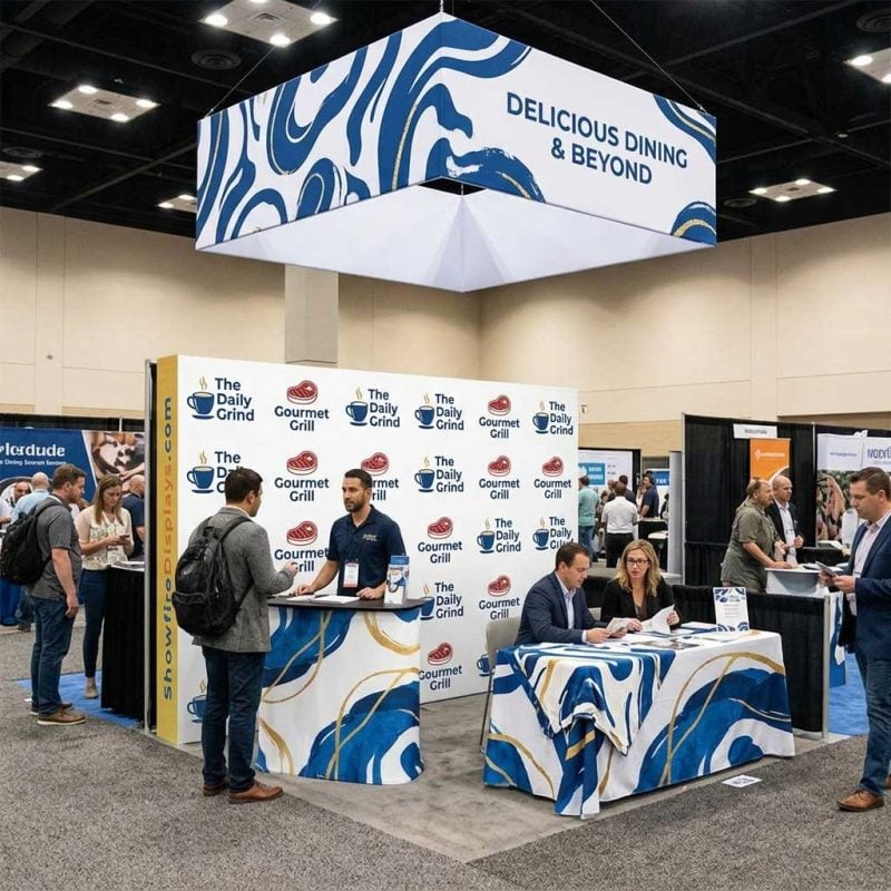
For a deeper look at fabric materials, hardware options, and ordering, the complete guide to step and repeat displays covers all of that in one place. This post focuses strictly on design: dimensions, spacing logic, and layout decisions that hold up under event lighting and a camera lens.
Why Logo Size and Spacing Are the Core of Step and Repeat Design
A step and repeat banner works because logos tile across the background in a repeating diagonal or grid pattern. When someone stands in front of the display, every photo captures at least two or three full logos, so sponsors and brands stay visible no matter where the subject is positioned in the frame.
If logos are too small, they disappear in a mid-distance photo. If they are too large, only part of a logo shows in the frame and the display looks unfinished. Spacing errors cause a different problem: logos that sit too close together create visual clutter, while logos spaced too far apart leave dead zones where no brand appears at a standard 8-to-10-foot shooting distance.
Understanding those failure modes is the first step in knowing how to design a step and repeat that actually performs at an event.
Standard Banner Sizes and What They Mean for Your Layout
Before placing a single logo, you need to know your banner dimensions. The most common sizes in the US event market are:
| Banner Size | Typical Use Case | Logo Grid Rows (approx.) |
|---|---|---|
| 8′ x 8′ | Small red carpet, media wall | 4 rows |
| 8′ x 10′ | Corporate events, award shows | 5 rows |
| 10′ x 8′ | Trade show backdrop, press junket | 4 rows |
| 10′ x 10′ | Larger events, multi-sponsor walls | 5 rows |
| 10′ x 20′ | Conferences, activations with crowds | 5-6 rows |
If you are ordering a step and repeat and designing the artwork yourself, start with the finished print dimensions and work backward into your grid. For a detailed reference on matching dimensions to your event format, the Step and Repeat Size Guide: A Chart for Every Booth Format breaks down every standard configuration.
The rule of thumb that works for most configurations: a logo block (logo plus its surrounding margin) should be roughly 18″ to 24″ wide on an 8-to-10-foot-wide banner. That gives you four to five logo columns across the width, which is enough for consistent coverage in a standard photo frame.
How Big Should a Logo Be on a Step and Repeat Banner?
The question “how big should a logo be on a step and repeat banner” comes up constantly, and the answer depends on two things: how many logos you need to fit, and how complex each logo is.
A single-brand display has the most flexibility. The logo itself (not counting margin) can run 12″ to 16″ wide without overwhelming the frame. A multi-sponsor display with four to eight brands needs smaller individual logos, typically 8″ to 12″ wide, so all brands appear together in a single photo without any one brand dominating.
A practical sizing formula:
- Take your banner width in inches (96″ for an 8-foot banner).
- Decide how many logo columns you want (four is the standard).
- Divide: 96″ / 4 = 24″ per logo block.
- Reserve 20 to 25 percent of that block for margin on each side.
- Your active logo area is roughly 14″ to 16″ wide per column.
Logos with thin lines, fine serifs, or intricate icon details need more room to stay legible at a distance. A bold, simple wordmark can go a little smaller; a detailed crest or emblem needs to be sized up.
Spacing and the Diagonal Offset: How the Grid Actually Works
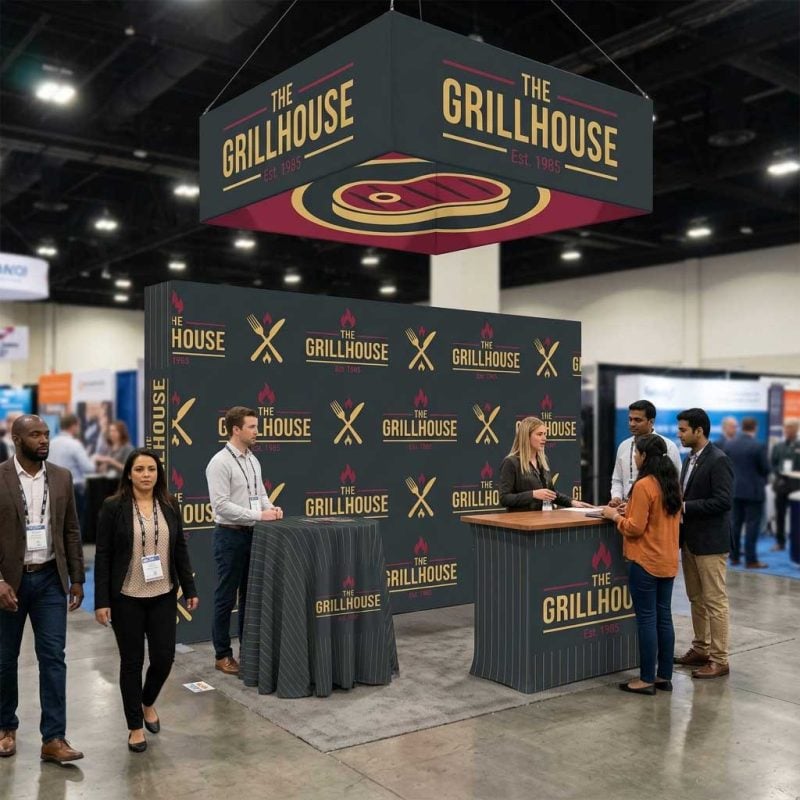
The classic step and repeat layout is not a straight grid. Each row is offset horizontally by half a column width, which creates a brick-like diagonal pattern. This is intentional: the offset guarantees that at least part of a logo appears in the frame even when a subject shifts left or right.
Here is how to build the offset grid correctly:
- Row height: Set row height equal to roughly 80 to 90 percent of your logo block width. If logo blocks are 24″ wide, rows should be 19″ to 22″ tall.
- Horizontal offset: Shift every other row by exactly half the column width (12″ in that example).
- Bleed: Let logos at the edges of the banner bleed off by 50 percent. A half-logo at the edge completes to a full logo in the next photo, keeping coverage consistent.
If you are using design software, set up a grid with guides before placing logos. InDesign and Illustrator both handle this cleanly. Canva can work for simple single-logo layouts but tends to struggle with precise bleed placement. If you prefer to work in Photoshop, the Photoshop Step and Repeat: A Trade Show Layout How-To Guide walks through the full process step by step.
Working with Multiple Logos and Sponsor Hierarchies
Multi-sponsor step and repeat with logos requires an additional layer of planning: hierarchy. Not all sponsors are equal, and your layout needs to reflect that without creating chaos.
A workable three-tier approach:
- Tier 1 (title sponsor): Logo sized 20 to 30 percent larger than tier 2 logos. Appears in every row.
- Tier 2 (presenting sponsors): Standard size. Alternates with tier 1 in the offset pattern.
- Tier 3 (supporting sponsors): 20 to 30 percent smaller than tier 2. Fills remaining space in alternating rows or appears in a secondary band at the bottom.
Color matters here too. If sponsor logos use wildly different color palettes, the step and repeat backgrounds you choose will heavily influence how unified the final display looks. A dark navy or black background tends to let colorful logos pop without competing. White backgrounds work for clean, modern looks but require that every logo has enough contrast to remain visible.
File Setup: Resolutions, Formats, and What to Send
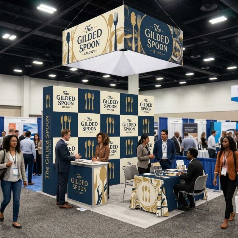
Even the best step and repeat design falls apart if the files are built incorrectly. Banners are printed large, so resolution at final print size matters.
| File Type | Minimum Resolution | Notes |
|---|---|---|
| Raster (JPG, PNG, TIF) | 150 dpi at full size | 72 dpi screen resolution will print blurry |
| Vector (AI, EPS, PDF) | Infinite (resolution-independent) | Preferred format whenever possible |
| Mixed (logos embedded in layout) | Embed at 150 dpi minimum | Linked files must be packaged |
Always request vector files from your brand or sponsor contacts. When vector is not available, ask for the largest raster file they have and confirm it is sized for large-format use, not a web thumbnail.
One thing that saves a lot of back-and-forth: at ShowFire, our designers create a free mockup using your actual artwork before anything goes to print. You see exactly how logos scale, how the grid tiles, and whether any file quality issues need to be corrected, all before you commit.
Common Mistakes and How to Avoid Them
The best step and repeat design is usually the result of avoiding a short list of repeated mistakes. These are the ones that cause the most reprints:
- Scaling up low-resolution logos: A 300 x 300 pixel PNG designed for a website will look pixelated at 12″ wide on a printed banner. Always check actual pixel dimensions, not just the file size.
- Ignoring safe zones at the top and bottom edges: Logos placed within 6″ of the top or bottom edge may be obscured by hardware hardware frames or curled edges. Keep key artwork at least 6″ from any edge.
- Mismatched color modes: Logos provided in RGB will shift color when converted to CMYK for print. Convert or request CMYK versions when possible, especially for brand-critical colors.
- Forgetting the shooting distance: Design for how photos will actually be taken. A photographer standing 8 to 10 feet away with a 50mm equivalent lens captures roughly a 6-foot-wide slice of the banner. Your grid needs to fill that slice with at least two full logos.
Pulling It Together: A Quick Layout Checklist
Before you send files for print, run through these in order:
- Banner dimensions confirmed and canvas set up at true print size
- Logo sizes fall within recommended ranges for the number of sponsors
- Offset grid built with correct row height and horizontal shift
- Edge logos bleed by 50 percent of their width
- All files at 150 dpi minimum (or vector)
- Color mode is CMYK
- 6″ edge buffer respected on all four sides
- Mockup reviewed and approved before production begins
Ready to Print?
Knowing how to design a step and repeat from scratch is valuable, but you do not have to do it alone. If you are still choosing the right banner size, format, or hardware for your event, our step and repeat displays page walks through every available configuration so you can match the display to your venue and audience.
If your event setup also involves larger booth structures, the trade show displays buyer guide is a useful reference for understanding how backdrops fit into a full exhibit strategy. And if you are considering ceiling-hung signage to complement your media wall, the trade show hanging banner guide explains sizing, rigging considerations, and how suspended signs work alongside floor-level displays.
For attendees who want a full booth backdrop without an event-specific media wall, it is also worth checking the fabric pop up display guide to compare fabric tension systems with traditional step and repeat hardware before you decide.
The best step and repeat designs come from understanding exactly how photos will be taken, sizing logos for that specific scenario, and building a file that prints cleanly at large format. Follow the rules above and your display will look exactly as professional in event photos as it does in the proof.


